This is my A2 media coursework blog. I will be creating a music video for the song 'Confessions' by 'We Are The Ocean'. The project also involves creating a digipak album and a magazine advert for the digipak.

I am working in a group with:

Monday 28 February 2011

Kanye West - All Of The Lights


    • This is slightly a little bit off topic from the music video but i still think this is quite a interesting and valid post.
    • The music video for Kanye West's song 'All Of The Lights' was released the other day (February 19th 2011) and as I was watching it for the first time i thought of quite a few valid points that could be taken from it to do with music videos in general and also the music video for 'Confessions' that i'm currently working on. 

    • The video is directed by Hype Williams who is an American music video and film director who is very successful and produces mainly rap and hip-hop videos. He also wrote West's short film 'Runaway' has also been a huge success and boosted Kanye's career even further. Many critics thought that Kanye West's career was over after the events at the 2009 MTV Music Video Awards but his latest album 'My Beautiful Dark Twisted Fantasy' (released in November 2010) has proved them wrong and it has been a massive success and West has risen back up in peoples estimations.
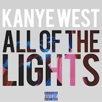
    • Personally i think the form and structure of the song 'All Of The Lights' is similar to 'Confessions' in the way it builds up and the big crescendo towards the chorus and the way that the pace flows really well throughout the whole song and the difference of the beginning to the end of the song. 
    • Carol Vernallis talks about this in her book "Experiencing Music Video". She looks at the way certain things happen at different points in the video and the structure of the song reflecting the structure of the music video. Vernallis also talks about how there is a rhythm to the video that is created through what is on screen and using different shots and also how it's edited in the post production.
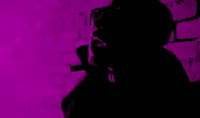
    • I think Kanye West uses the theory that Carol talks about really well in this video. From start to finish it flows really well and what is on screen visually reflects what is happening in the music and it builds up to the crescendo at appropriate moments. The chorus is very different to what the verse is like and this is also very well reflecting through the music video.
    • Hype Williams has used a flashing effect in the video which I think works really well and makes very good use of cutting to the beat which is very effective. Me and Mary have decided to use fast paced editing within our video especially during the fast moving chorus'. During the editing stage we were a little bit sceptical about using it and questioned whether people would or would not like it but when I saw this video I thought it would work and I actually think it's really effective in reflecting the nature of the song and also creating shot variation so it's more interesting for people to watch.

    • A layering effect has also been used as well which we are using within our video. This creates a good intertextual link to our video and it's good to see that the effect can be used across generes even though they are totally different songs musically.
    • In places i think it can be a slightly bit inappropriate with Rihanna not wearing much clothing but this is used so it appeals to a male audience using the male gaze theory and it is fairly stereotypical for a music video of that genre. There is a very big use of strobing all the way throughout the video which i think works quite well because it helps it to make the video flow and it also matches the pace of the music. At the beginning of the video there is a warning for people with photosensitive epilepsy because of this, and the video has had to be banned from airing on some TV channels worldwide. 
    • It seems whatever West does he always seems to cause controversy and disorder in some way but I guess that's how you become 'individual' and get recognised for being different and making people think. 

    LM / MJ - Magazine Advertisement.

    • To create the magazine advert we looked in a couple of editions of 'NME' and also 'Kerrang' to see real examples of digipak adverts and other general album adverts that were from the genre that we were working in (alternative rock and post-hardcore) and so we could also get some inspiration. 


    • We have decided as a group that 'Kerrang' and 'NME' would advertise our digipak and that the target audience for both the band themselves and music video that we made would definitely buy these music magazine as opposed to others such as 'Q' and 'Mojo' etc. 


    Backgrounds:
    • We decided that either of these images would create a good magazine advertisement background.
    • From looking at existing adverts (in 'Kerrang' and 'NME') and CD covers by 'We Are The Ocean', we noticed that most were very graphical like and not just photos, so we decided the picture of Emily under the bridge would work well. This was chosen rather than the brick/ wall image because it had a bit more depth as opposed to just a boring brick wall which was quite plain and it also links to the genre of music that we were working with. 
    • We didn't want it too link too much to the music video because the advert was selling the digipak album  and not just the music video. We took this on the digital SLR camera during the music video shoot.


    The Digipak Album


    • We have decided as a group that the digipak that we are producing is going to be a live album with an extra bonus  special edition music video for 'Confessions'. 
    • The original idea was going to include actual live tracks that we would download the audio from youtube off but after doing some research we found that not all of the tracks had very good audio quality and it would be pointless including them on the digipak. 
    • After much discussion we have finally decided that the digipak will be quite a simple gatefold layout with one sleeve for the audio cd and the other sleeve for the dvd with the music video and special edition bonus documentary and behind the scenes photos.

    Tuesday 8 February 2011

    C.L. Magazine Research

    We researched which magazines We Are The Ocean would advertise in because Mary is a fan of them and we therefore knew some well known magazines. We also looked in the corner shop to see what magazines were on offer and how they appealed to their target audience. 

    One magazine our band would advertise in is 'Kerrang!' Made by Bauer Consumer Media.
    If a band is featured their picture is taken with large white sans serif lettering overlayed. The rest of the text surrounding the image in sans serif font signifies other pages within the magazine because it is smaller and sans serif font too. The sans font surrounding the main title tells the user extra information. The angle of the writing and change in colour of the text appeals to younger audiences because it signifies rebelliousness. While the image of and older band relates to an older audience. This magazine appeals to 15-34 with predominantly males it being a rock magazine however the use of a male band appeals to female audiences. Using the commutation test if this magazine used say for example the colours pink and purple it would appeal to a young female audience 8-12. But the use of the colours black grey and red appeals to a mature male audience the black signifying the band as mysterious and bad. 

    In this inside feature the image is the predominant part. The image itself is helping to signify the bands image it being an ocean. The fact the appear to be riding it signifies the band as fun and carefree and appeals to teenage audiences 15- 24. However the image remains polysemic to draw its audience in further. The image overlays the title to signify the image belongs with the title. 
    NME the New Musical Express magazine is a popular Magazine in the United Kingdom which started in 1952. It begun with Pop music but as Rock music developed in the late 1960's it developed into a rock music magazine. [wikiYou would be more likely to find popular British bands on the magazine. With an advert once again the focus is the image. With rock bands the general image shows the rock band messing around in brightly coloured clothing in an interesting setting which relates to the title of the single. Unless they are a metal band or the single is particularly sad, in which you would see a much moodier photo with low key lighting and black clothing. In this photo produced from a garage rock band the image is to fit the image of the band as rebellious. With jaggedy writing and the image of a riot. The red colouring signifying danger and revolt. A much more controversial magazine displaying more Punk like bands would appeal to an much older audience 24-45. It would therefore be less likely to post a friendly feature from We Are The Ocean as above. 


    Q magazine is a pop music magazine likely to show popular music although it does advertise rock music it began in 2007 [wiki]. An image like the one to the right would appeal to the male gaze with the use of jaguars. However it would also appeal to young females 12-16 with the use the feature article being Lily Allen. With the rate of advertising £200 for a full page of just 5,000 readers then I doubt a small indie company could afford to advertise in such a magazine.

     
    Big Cheese Magazine is a small independent Magazine that bases on Punk, Metal, Rock and Alternative Rock. [wiki] These would therefore be likely to advertise rock concerts We Are The Ocean perform in. In the 2 page spread opposite the key image is the sweater band member appearing to have a good time in a small room. This signifies the band is personal. The use of the stamp like typography signifies that they like to make an impact.

    Rough Cut 1 and Feedback


    Feedback:


    Feedback from


    From the screening in class: 
    • We need to look at each shot individually and see whether it could be improved in any way, if not then delete it.
    • The editing needs to reflect the song a bit more.
    • More narrative is needed to find out why she is running away from home.
    • We need to experiment a little bit more with Final Cut because there is lots of different effects and possibilities that we could use in our music video. Especially the multiple video layers effect.
    • The performance footage is very good but it could be used better. Some of the takes are too long and it needs to be intercut into the rest of the video a little more and not just in the chorus. 
    • Repeat the part where she is with her friends coz it's a nice shot and it works really well, however, the fade could be a little bit slower. 
    • It's a bit too repetitive in parts.
    • The narrative gets lost in the later section, nothing much really happens and there is too much performance.
    • The panning shot from behind worked really well but there are a few that aren't framed very well, her head is chopped off in quite a few takes.
    • The high angle shot filmed from above worked really well. 
    Actions to be taken from the feedback we received:


    •  Sync the performance shots with the lyrics in the music.
    •  Look at the shots individually and decide if there framed well and work well and if anything else can be done to it.
    •  Make the editing reflect the pace of the song. Final Cut has a tool that allows the shot to be in time. Use it! 
    •  Re-look at the narrative and make it fluid throughout so people can easily understand what's happening on.
    • Split the performance footage up more, make the guitar solo footage shorter to maintain audience interest.
    • Use more final cut effects (layering of shots etc..).
    • Make the friends disappearing effect (fade transition) last for longer.
    • Make it less repetitive, lots more variation of shots.

    Monday 7 February 2011

    Moodboard


    Shot List/ Filming Schedule

    Shot list

    Special Edition Documentary


    When we were out filming Chris undertook the role of making a documentary as a special edition extra to go on the digipak album that we will be producing. The video just gives an insight to the music video shoot and what happened on the days that we filmed. 
    I hope you enjoy it and please feel free to leave any feedback and advice on it.